
What happens in the first three seconds
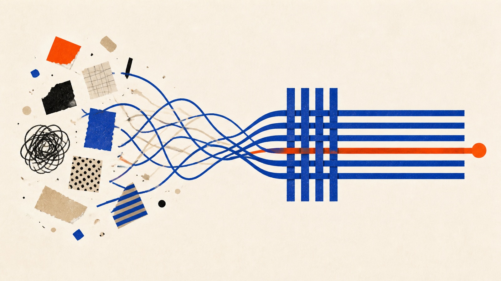
A visitor lands on your page and decides, before reading a single sentence, whether your business is worth their time. Nobody sits down with your credentials and reviews them like a hiring manager. They glance, they feel something, and they either stay or hit back. That judgment happens in about three seconds: closer to a blink than a decision, and closer to instinct than evaluation, which means it happens well before your price, your copy, or your product ever get a chance to make the case.
The book in this kit, Visual Selling, treats that window as biology rather than a design nicety. The brain's limbic system, which handles fast trust-or-danger calls, doesn't wait for logic. It reacts to color, layout, and image quality before the rational brain gets a vote, which means a business can lose a visitor's trust before its actual offer ever enters the conversation. A 2014 MIT study on image recognition put the number even lower: the brain can identify what it's looking at in as little as 13 milliseconds, well before conscious attention catches up.
The mistake most small businesses make isn't a lack of effort. It's not knowing which visual signals are doing the deciding, so the effort goes into the wrong three seconds.
The trust triangle, and the rule behind a real 6.3% lift
The book breaks that first judgment into three checks it calls the trust triangle: visual credibility (does this look clean, intentional, professional), authority signals (certifications, awards, logos that borrow someone else's credibility), and competence cues (consistent branding, clear navigation, the small signs of an organized operation). Miss any one point and the whole triangle collapses: a beautifully designed page with an inconsistent logo still reads as unreliable, because the mismatch itself is the signal customers notice.
Some visual choices actively destroy trust rather than merely failing to build it. The book's list of first-impression killers is specific: blurry or pixelated images, text that's broken or poorly formatted, a logo that looks different on the website than on the business card, layouts so cluttered a visitor can't tell what to look at first, and generic stock photography that makes a real business look like a template. Any one of these does more damage than having no visual presentation at all, because a visitor doesn't read them as unfinished. They read them as careless, and generalize that carelessness to the product.
For color specifically, the book gives a rule simple enough to apply without a designer: 60-30-10. Sixty percent of a design carries your primary brand color, for consistency and recognition. Thirty percent goes to a secondary color that supports it without competing. The last ten percent is a single "pop" color reserved only for the action you want taken (a buy button, a phone number, a signup form), and its power comes specifically from how rarely it appears elsewhere on the page.
The book's real-world proof of how much a small color decision can move is RIPT Apparel, a small e-commerce business that changed its buy button from black to green (nothing else on the page moved) and saw conversions rise 6.3%, because the green stood out clearly against a white background where the black one had blended in. It's a small test with a specific, checkable result, which is exactly the kind of claim worth trusting more than a general one about "colors that convert."
Where people go wrong
The most damaging mistake is inconsistency: a logo, color palette, or tone that shifts between the website, the social profiles, and the business card. The book is direct about the effect: customers notice the mismatch even when they can't name what's wrong, and it reads as evidence of a disorganized business rather than a busy one. Its fix is a one-page brand guide: exact color codes, font names, logo rules, checked monthly against whatever's actually been published, so a business doesn't discover the drift a year in.
A second mistake is defaulting to whichever color the business owner personally likes rather than the one that matches the job: the book notes plainly that a favorite color like purple doesn't create urgency, no matter how much you prefer it to red, and that industry expectations matter more than personal taste: deep blue for a financial advisor reads as trustworthy, the same blue on a restaurant reads as cold. A third is generic stock photography standing in for real product shots; visitors have seen the same handshake photo on a dozen other sites, and it reads as evidence nobody bothered rather than as polish. The book's alternative is blunt: a slightly imperfect photo of the product actually being used will outsell a polished studio shot that feels distant, because context reads as more credible than perfection.
Visual trust is one input into a longer chain of proof a buyer checks before saying yes, which the sales and closing guide covers stage by stage.
Inside Visual Selling
Going deeper
- AudioVisual Influence
- BookVisual Selling
- ChecklistColor Psychology Implementation
- ChecklistThe 3-Second Trust Elements Implementation
- GuideThe 3-Second Trust Builder
- Listicle13 Color Blunders Costing You Sales
- Listicle21 Visual Triggers Every Marketer Must Know
- Mini-CourseWin Customers with Design
- Prompt PackVisual Marketing Excellence
- ToolstackSell With Design
Visual Selling is one of 14 bundles in The Sales & Closing Pack, or take the whole pack for $29.
Related reading
Selling for people who never wanted to be in sales: the complete guide
How selling actually works for freelancers and consultants: nerve, offer, proof, the conversation, pipeline and retention, in dependency order.
Read more
What to say when a sales call stalls
A cold-calling framework for opening lines, objection responses, and reading when a prospect is ready to close.
Read more
Which customer story is worth telling
A scorecard for choosing which client success is worth turning into a case study, with the scoring math and cutoffs.
Read more