
Pick your adjectives before your colors
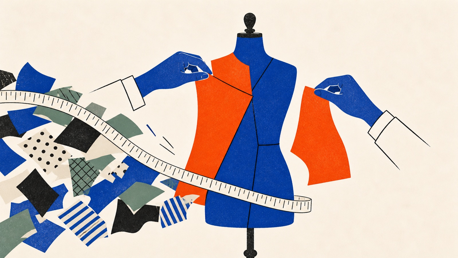
Imagine a surgeon walking into a pre-op room in a stained t-shirt, unkempt hair, and a coffee cup that looks fished out of a bin. Nothing about their actual skill has changed. But something in you says run, because we instinctively link appearance to competence, and a mismatch between the two reads as a warning rather than a coincidence.
Businesses get judged the same way, faster than anyone reads a word of copy. Research from Stanford's web credibility project found that 75% of people judge a company's credibility on visual design alone, and a separate study put the number who'd distrust a site over its design at 94%. Three out of four visitors decide whether to trust you before your carefully written homepage copy gets a chance to say anything.
How To Build A Consistent Visual Identity refuses to start with a color wheel, on the grounds that you can't pick the right blue for a business you haven't described in words yet.
The Cocktail Party Test, and what it's for
The book's fix for vague design briefs ("I want it to pop," "I want it clean") is a technique it calls the Cocktail Party Test. Imagine your brand as a person at a crowded networking event: how do they dress, how do they speak, and above all, how do the other guests describe them once they've left the room? If the answer is "they were nice," the exercise has failed. Nice is generic. You want authoritative, or rebellious, or nurturing: a word specific enough that it rules things out.
From there, the book asks for three to five core adjectives pulled from three categories, not generic filler like "quality" or "professional" that every competitor already claims:
- Emotional: how should the customer feel? (safe, excited, understood)
- Descriptive: what's the nature of the service? (precise, rustic, industrial)
- Stylistic: what's the personality? (minimalist, retro, futurist)
For each adjective, the book also asks for an anti-adjective: the neighboring word you're not. The skincare example below could be "scientific" without being "clinical," or "urgent" without being "alarming." Naming the boundary keeps a design from drifting into territory that feels close enough to on-brand without actually being it, since nobody can write a rule for every wrong turn in advance. If the adjectives are hard to pin down at all, the book offers brand archetypes as a shortcut: Creator, Innocent, Rebel and similar character types that already carry a visual language with them, so a Creator brand like LEGO and an Innocent brand like Dove start from almost opposite palettes before either picks a single hex code.
Vague adjectives produce vague design, no matter how skilled the designer is. The book's illustration of the cost: a security-training company with a cartoonish eagle logo, bright neon colors and a site that's hard to navigate for anyone over fifty, not because anyone involved lacked good intentions, but because nobody had written down that the brand needed to read as disciplined before anyone touched a color palette. The visuals told potential clients the training itself couldn't be trusted, regardless of how good it actually was.
The book's own worked example shows the alternative. A hypothetical men's skincare brand defines its adjectives as scientific, concrete and urgent, then builds a mood board by looking outside its own category rather than at other skincare bottles: vintage apothecary labels and lab equipment for "scientific," brutalist architecture and raw concrete for "concrete," Swiss airport signage for "urgent." The result reads as distinct because it was never assembled from the same five images every competitor already pinned.
Where people go wrong
The first mistake is opening design software before the adjectives exist. It feels productive (colors and fonts produce something to look at within minutes) but without a written brief, every choice after that is taste rather than strategy, and the founder becomes the permanent bottleneck on every decision.
The second is mood-boarding from direct competitors. A coffee shop that only looks at other local coffee shops ends up with the same subway tile and the same Edison bulbs everyone else already has. The book's advice is to look at adjacent industries that share your adjectives instead, which is how the skincare example above avoided looking like every other bottle on the shelf.
The third is the "Subjectivity Trap": choosing images because you personally like them rather than filtering everything through what the audience needs to feel. A finance consultant who loves punk aesthetics and builds a mood board full of neon spray-paint textures might find it authentic; a client about to hand over a million dollars reads it as instability. The strategic groundwork this depends on (knowing who you're for before you decide how you look) sits earlier in the sequence covered by the full brand-building guide.
Inside How To Build A Consistent Visual Identity
Going deeper
- AudioThe Strategic Brand Kit
- BookHow to Build a Consistent Visual Identity
- ChecklistPre-Launch Brand Kit Setup
- GuideBuild Your Brand Guide in One Weekend
- Listicle13 Visual Decisions That Separate Professional Brands From Amateur Ones
- Mini-Course7-Day Brand Design
- Prompt PackCreate Professional Visual Identity
How To Build A Consistent Visual Identity is one of 11 bundles in The Brand & Story Pack, or take the whole pack for $29.
Related reading
Brand building when nobody has heard of you: the complete guide
Positioning, story, voice, visual identity and reputation, in the order they actually depend on each other, and what to do first with no budget.
Read moreThe five-stage story every launch skips
Most launches arrive as one email that dumps every feature and every proof point at once. A five-stage narrative arc, mapped to the reader at each stage.
Read more
Voice doesn't change. Tone does.
A brand voice should stay fixed while tone moves with the moment: the book's tone-playbook method, with a market-downturn message as the worked example.
Read more